Heyylo,
I am glad you found this page! Welcome to Shimaila's creative space.
She plays with colors and fonts, while secretly drawing pictures of cats.
A digital wizard who casts spells with her stylus, which usually end up on billboards or familiar sites
Aafrien
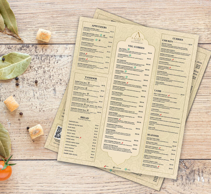
Menu and voucher design for a high-end classic Indian restaurant in Canada


Case Study
INTRODUCTIONAafrien, a prestigious Indian restaurant located in Canada, approached me to design a menu that would reflect the essence of classic Indian aesthetics. This case study highlights the process, challenges, and outcomes of this creative project.CLIENT BRIEFAafrien's client brief was clear and concise: they wanted a menu design that exuded a classic Indian look while maintaining a sense of sophistication. The design had to capture the spirit of their cuisine and create an engaging experience for diners.DESIGN CONCEPTClassic Indian Aesthetics with a Contemporary Twist:
To embrace the classic Indian theme while infusing a touch of modernity, I incorporated a new color palette. The rich heritage of India was still at the core of the design, but with a fresh twist.DESIGN ELEMENTS:Color Palette:Goldish Gradients: The addition of goldish gradients added a touch of opulence and sophistication to the design, especially for borders and decorative elements.
Beige and Light Cream: These background colors evoke a sense of calm and elegance, providing a perfect canvas for the design elements.
Hint of Black: Black text added contrast and ensured readability, making the menu user-friendly.Typography:
Elegant, serif fonts were retained to maintain readability and sophistication, perfectly complementing the classic-modern blend.Illustrations and Graphics:
Intricate Indian patterns and motifs remained integral to the design, creating a harmonious balance between the classic and contemporary.Layout:
The user-friendly layout was preserved to guide diners through the menu seamlessly.SWOT ANALYSIS:Strengths:
The revised color palette, with goldish gradients, added a sense of opulence and modernity while still adhering to classic Indian aesthetics.
The combination of beige, light cream, and black text ensures readability and usability, enhancing the overall dining experience.Weaknesses:
As with the previous design, some modern elements could be introduced to attract a broader audience.
The intricate design may require careful printing to maintain its quality.Opportunities:
Aafrien can further leverage the updated color palette to create a cohesive brand identity, ensuring consistency in their marketing materials.
Exploring digital menus and interactive versions can provide a modern twist on the classic design, appealing to tech-savvy diners.Threats:
The competitive nature of the restaurant industry calls for continuous design evolution to stay relevant.
Ensuring the uniqueness of the classic Indian theme amid potential copycat designs from other restaurants is vital.CONCLUSIONThe menu design for Aafrien, with its revised color palette, successfully marries classic Indian aesthetics with a contemporary touch. The SWOT analysis highlights areas for improvement and opportunities to strengthen Aafrien's brand presence. As a graphic designer and illustrator, I remain committed to helping Aafrien adapt to the ever-changing market while preserving its rich cultural heritage.
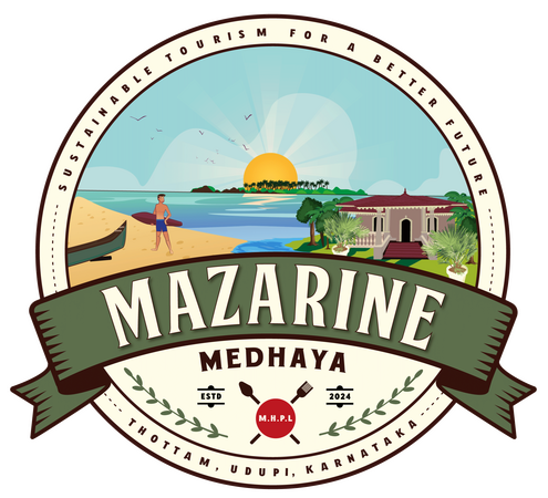
Mazarine
Emblem design for
a tourism company with illustrations
of the homestay & it's surroundings

Dey Research Lab
Logo mark redesign for a
medical research lab symbolizing
molecular system in chemistry

Lickies
Pictorial Logo mark design for a dog food brand, incorporating colors that are visible to dogs, such as blue and yellow
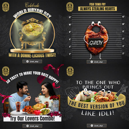
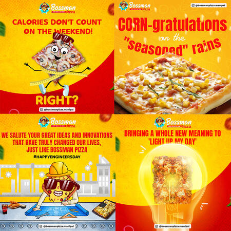
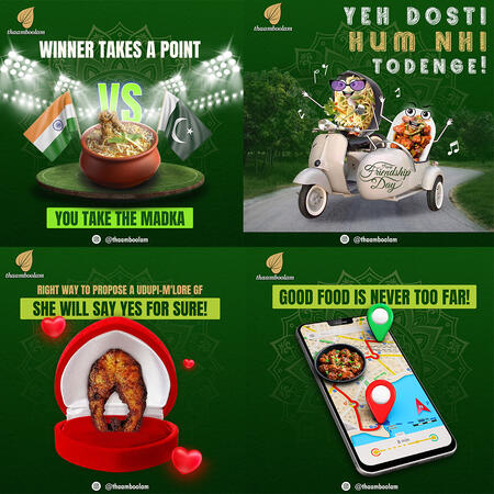
Social Media
Step into the world of design through these images, where I've translated clients' visions into captivating visuals.